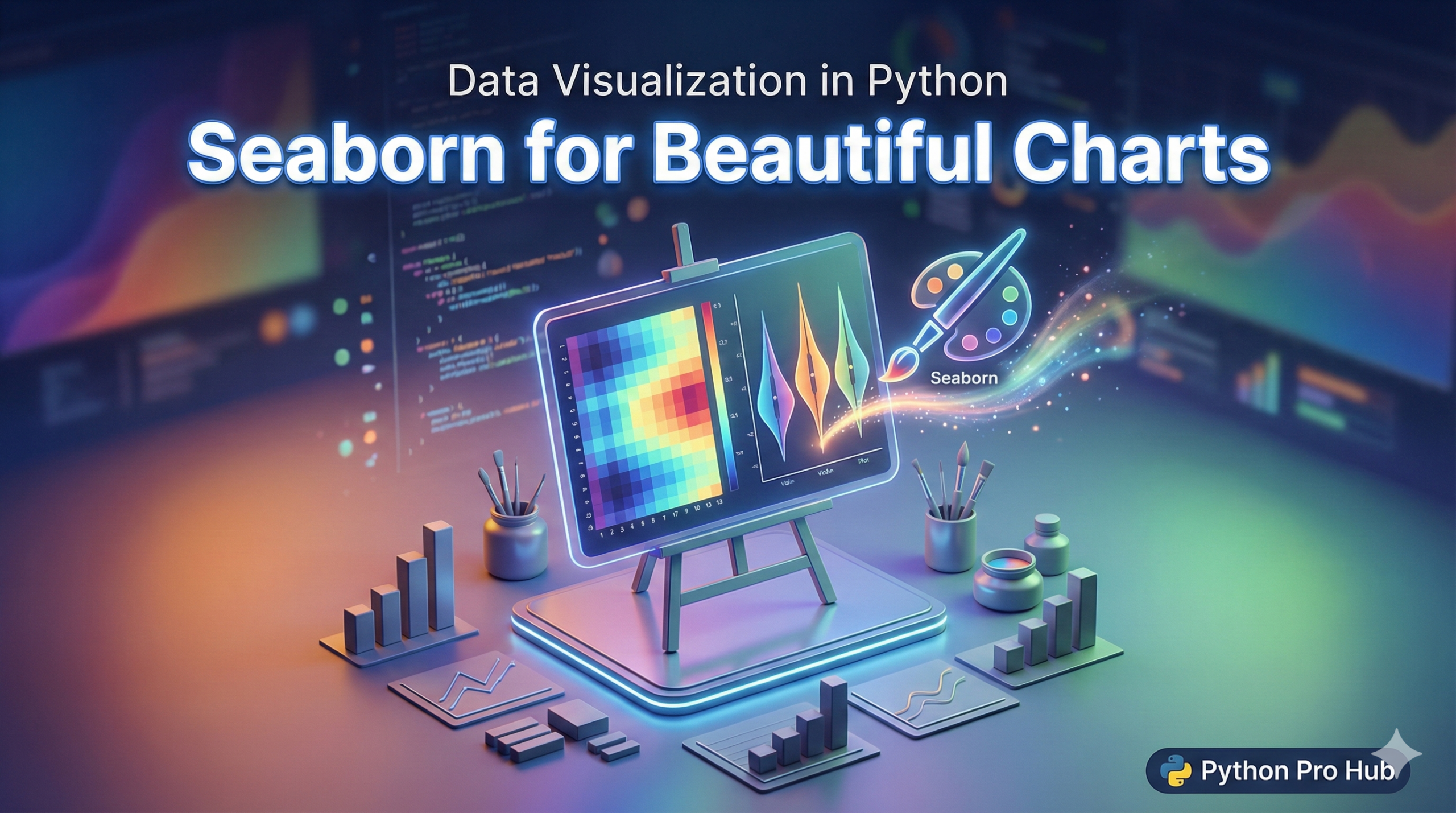
While Matplotlib is powerful, its default charts can look a bit… basic. For those new to data visualization, a Seaborn Beginner Guide can be very helpful.
Enter Seaborn. It’s a library built on top of Matplotlib that makes your charts look modern and professional by default. It also integrates perfectly with Pandas DataFrames.
Step 1: Installation & Import
Install it in your virtual environment:
pip install seabornIn your script, import it along with Matplotlib (we still need Matplotlib to show the final chart):
import seaborn as sns
import matplotlib.pyplot as plt
import pandas as pd
Step 2: Load Some Data
Seaborn comes with some built-in datasets for practice. Let’s use the famous ‘tips’ dataset (restaurant tipping data). This is often one of the first tasks in a Seaborn Beginner Guide.
tips = sns.load_dataset("tips")
print(tips.head())
Chart 1: The Scatter Plot (scatterplot)
Let’s see if the total bill amount affects the tip.
sns.scatterplot(data=tips, x="total_bill", y="tip")
plt.show()
Just one line of code, and it already looks better than standard Matplotlib!
Chart 2: Adding More Info (Hue)
Seaborn makes it easy to add a third dimension to your 2D chart using colors (hue). Let’s see if smokers tip differently than non-smokers.
# 'hue' will color the dots based on the 'smoker' column
sns.scatterplot(data=tips, x="total_bill", y="tip", hue="smoker")
plt.show()
Chart 3: The Box Plot (boxplot)
Box plots are great for comparing categories. Let’s see which day of the week has the highest bills.
sns.boxplot(data=tips, x="day", y="total_bill")
plt.show()
Conclusion
Seaborn is the secret to making “publication-quality” charts in seconds. It handles colours, legends, and labels automatically so you can focus on the data. For those exploring this library, a Seaborn Beginner Guide swiftly provides the essential steps and examples needed.